×
Your logo is more than a symbol in today's competitive digital economy; rather, it is the core element of your brand. For Airbnb logo evolution, which works in over 220+ countries with 150 million+ users, its logo became an essential tool in propelling towards scalable growth, global trust, and cultural connection. Airbnb’s rebranding journey starts from 2008 to 2025, revealing how data-driven brand evolution and strategic design decisions can power exponential business success. This case study explores the rebranding journey of Airbnb’s logo, the challenges faced by them, their strategic decisions, and how their design became a growth catalyst.

Airbnb started in 2008 as “AirBed & Breakfast”, offering short-term stays on air mattresses in apartments. The Airbnb logo evolution began with a quirky, two-line text featuring uneven styling, reflecting the brand’s experimental origins and humble beginnings.
By 2009, the brand officially became “Airbnb”, switching to a cleaner, single-line wordmark. This helped boost brand recognition and digital usability.
In an attempt to humanize its growing platform, a key phase in the Airbnb logo evolution introduced a script-style logo with rounded, handwritten typography in light blue, aiming to convey warmth and friendliness.
Airbnb began analyzing customer feedback data from UX testing and realized that 73% of surveyed users found the script-style font unprofessional or hard to read on mobile.
Although bookings rose during this phase, visual identity limitations hindered Airbnb’s international credibility. This insight laid the foundation for a more cohesive and global brand rebrand.
Before launching a full-scale redesign, a key phase in the Airbnb logo evolution involved adopting an inflated, bubble-text logo, offering a cleaner look but still lacking emotional depth.
Airbnb experienced 300% annual growth in international listings from 2012 to 2014. However, brand recall in markets like Asia and South America remained under 25%, according to Airbnb’s internal surveys
The brand needed a scalable, culturally neutral identity that conveyed both professionalism and emotion across demographics
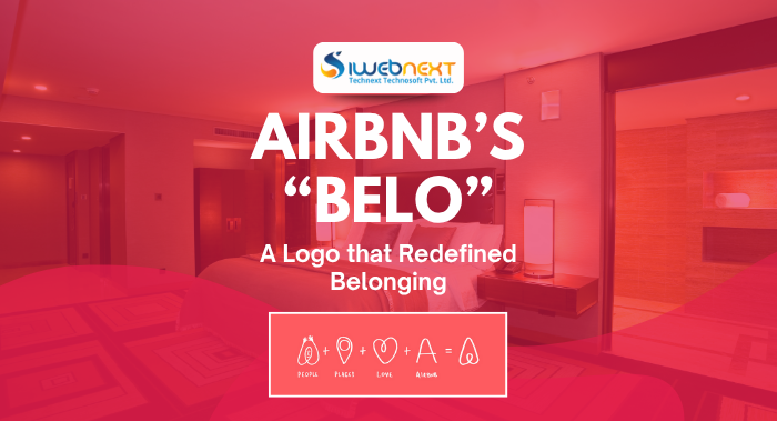
In July 2014, the company, as part of the Airbnb logo evolution, partnered with DesignStudio to introduce the Bélo—a geometric icon formed from four shapes: people, place, love, and the letter "A." It symbolized Airbnb’s new mission: “Belong Anywhere.”
Airbnb began positioning itself as more than just a booking platform. The Airbnb logo evolution reached a pivotal stage as the Bélo logo was integrated across merchandise, mobile UI, print campaigns, and video experiences. It became a universal stamp of trust.
Airbnb went public in 2020 with a valuation of $86.5 billion, particularly bolstered by emotional marketing and constant branding.
Airbnb’s next evolution came in the form of typography. In 2021, they launched a custom-designed typeface, Airbnb Cereal, enhancing its brand cohesion and readability.
Airbnb's logo evolution from 2008 to 2025 mirrors a carefully adjusted alignment between branding and business strategy. In the early phase between 2008 and 2009, the AirBed & Breakfast text-based logo was identified as a minimal viable product (MVP). As the platform grew over time, the era of 2010 to 2013 is introduced as a friendlier, script-style typography that insisted on building user trust and provided a personal appeal during the company’s formative mobile expansion. However, as Airbnb prepared to scale globally, it required a more robust and inclusive brand recognition.
In the year of 2014, this led to the monumental launch of the Bélo logo, indicates to a symbolic mark of belonging that transformed Airbnb from a simple tech platform into a culturally resonant brand. The Bélo identity played a major role in Airbnb logo evolution, resulting in a dramatic increase in both brand recognition and property listings.
By 2020, the consistency and impact of this branding strategy gave investors confidence during Airbnb’s IPO, with branding cited as a critical driver of its $86.5 billion valuation. From 2021 to 2025, the introduction of the custom Airbnb Cereal typeface further optimized the user experience across digital platforms, reinforcing brand coherence and supporting the company’s platform diversification into experiences, luxury stays, and entertainment.
Airbnb’s transformation from a modest startup into a global lifestyle brand did not happen by chance; it was the result of intentional, insightful, and data-backed design choices. The Airbnb logo evolution stands as a powerful example of how visual identity can drive global recognition and emotional connection. For businesses aiming to scale and resonate with diverse audiences, Airbnb’s rebranding offers more than inspiration; it delivers a blueprint.
Here are the key branding lessons that can shape your success story.Airbnb logo evolution from 2008 to 2025 is a compelling example of how visual identity, guided by data and purpose, can transform a startup into a powerhouse. The Bélo icon, once mocked, now serves as a universal emblem of community, trust, and discovery. iWebnext specializes in helping businesses design branding strategies that resonate across platforms and cultures. If you want to evolve your identity like Airbnb's logo evolution, our verified team is here to lead your transformation.